top of page

WORKS

Stories Told With Us

Most furniture companies opt for lofty language that is often pretentious and difficult to understand, and the furniture industry as a whole is not something that most people comprehend. Thus, in developing Bika’s catalog, we opted for simple language that could easily be translated to the common consumer, and a design that reflected Bika’s high standards and identity as a brand.

Bika

Bika: A Fresh Catalogue

From there, we conducted interviews, wrote and edited drafts, and designed the layout for each issue's online publication. Layers featured segments like On Radar, The Good Earth, The Figure, The Frame, The Collection, and The View. For The Figure, we had the privilege of interviewing industry icons such as Yuni Jie, Alvin Tjitrowirjo, Amalya Hasibuan, Yori Antar, Jessica Halim, and Rinaldy Yunardi, among others. Through this journal, our goal was to engage readers, strengthen the brand’s identity, and build credibility for INK and Coulisse with exclusive company updates and insights.

Coulisse INK

Coulisse INK: 'Layers' Journals

We designed the exhibition materials, wrote descriptions, and organized the layout and placement of the exhibits. In collaboration with interior design studio LIB for the layout and exhibition production studio this/PLAY, we brought the space and its content to life. The exhibition featured works from Design Leadership, FSRD, and ITB, all centered around the theme “Budaya Sepeda Motor dan Kreativitas Evolusioner”. It was also supported by the Japanese manufacturer SAN-EI, which showcased innovative products. Together with our partners, we created an immersive experience that introduced a fresh approach to creative thinking.

Eisuke Tachikawa (NOSIGNER)

“Kreativitas Evolusioner” Exhibition

Through the “You Do You” book Ruby shares his experience and personal insights on self-awareness and ikigai, which he has gathered and learned throughout his 10+ years of experience. It was a challenge editing his 10+ years experience and designing a book that would represent it, but the book opens up new perspectives on life for us to see and walk through by making the most out of ourselves, instead of trying to be preachy. As Ruby often says, you do you.

Fellexandro Ruby

Fellexandro Ruby: "You Do You" Book

As a furniture brand, we were intimately familiar with what the company needed before we even started working on the project, owing to our experience with other furniture brands. We wanted to capture the essence of the company as accurately as possible, to capture their values in a format that was as compact and succinct as possible. This is because most people do not have the time to read an extensive document of a company, which is why it’s better to keep company profiles compact.

CVP

CVP: Company Profile
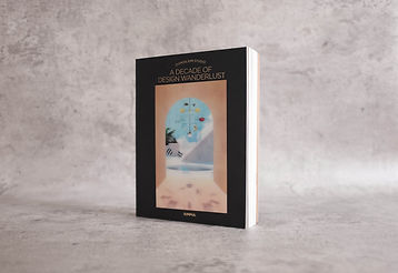
Our design and editorial team strived to translate the whimsy and quirkiness characteristic of Domisilium into the bilingual book. Beyond that, we also had to conceptualize the launch of the book. We pushed to translate the fun, quirky, yet mature nature of the book into the event itself, which was held at the Modena Showroom, one of the projects Domisilium worked on. The space was styled in by several stylists collaborating with one another while taking cues from the themes and projects within the book. Featuring a talkshow, dinner, and signings, the event was an intimate yet learning experience for attendees.

Domisilium

Domisilium Studio:
A Decade of Design Wanderlust

In addition to organizing these events, we executed a comprehensive marketing campaign to boost book sales. We developed the strategy, created engaging content for social media and other platforms, and wrote compelling copy that highlighted the book’s unique selling points. The visuals, crafted to align with the Kreativitas Evolusioner identity, strengthened the campaign's impact. As a result, book sales steadily increased, and the events attracted a diverse audience from creative industries, business, tech, media, education, and literacy.

Eisuke Tachikawa (NOSIGNER)

"Kreativitas Evolusioner" Marketing Campaign

<p class="font_8">So we developed a narrative that could keep the prestige and classic elegant design of the Frank &amp; Co brand while offering a deeper meaning, connecting it to the Frank &amp; Co customer base. The “Love Knot” collection espoused a deep connection and partnership in life, which marriage should entail, bringing out the feelings that partners have for one another.

Frank & Co

Frank & Co: A New Collection

To make said newsletter special and memorable, we chose to create an animated newsletter, to make it as interactive and engaging as possible. The design had to be beautiful, and so did the content, the subject of the content, as well as the copy. All of this had to meld into one gorgeous whole, so that customers would keep subscribing and stay abreast of the latest developments and products that the brand had to offer.

Central Mega Kencan

Frank & Co E-Newsletter

We contributed to proofreading the text with insights from experts across multiple disciplines, designed the book layout, and managed its publication. The release was made possible with support from ITB and a translation grant from The Japan Foundation Headquarters. In Kreativitas Evolusioner, Eisuke examines how creativity can address pressing global challenges such as ecosystem collapse, pandemics, and natural disasters, motivating individuals to unlock their potential and drive global innovation.

Eisuke Tachikawa (NOSIGNER)

Eisuke Tachikawa: “Kreativitas Evolusioner” Book

However, where they differed from Indofood was that they wanted their products to be in each page of the calendar. So we had to develop a narrative that could include those products, and we came up with “Keluarga Sehat Kunci Indonesia Kuat” or “A Healthy Family Is Key To A Strong Indonesia.” We also broke up the year into three parts, with the first four months having the theme of “Self-Health”, the following four “Family Health” and the final four “Health for Everyone (Community).” All of the illustration and the text followed this general narrative, allowing for different Enesis products to get their chance to shine.

Enesis

Enesis: 2022 Calendar

We named this style the “Easy Retreat Style” to define Gayatri’s interior style which is always associated with blue-white colors, rustic, Indonesian-country style and a dash of oriental style. This name also helps people easily remember Gayatri as well as her style.

Gayatri Wibisono

Gayatri Wibisono's Book:
Easy Retreat Living

Our Clients

Logo Client.jpg
SELFISH_Theo1.jpg

We want to hear what you need to tell to the world. 

Simpul Group Creative Communication Agency Logo

CONTACT

Jakarta, Indonesia

INSTAGRAM

LINKEDIN

© 2017 by Simpul Group

bottom of page